Nesquik
For more than 70 years, Nesquik has been providing smiles and nutritional yumminess to generations of families. Struggling to resonate with a new generation, Nesquik team invited us to modernize and introduce a new take on the brand’s playful spirit.
Over the decades, the brand’s VIS became a collection of classic big brand effects: splashing liquid on top of layers of gradients, bevels and drop shadows. To redefine the brand and bring focus to the key assets we believed simplification was the carrot on a stick.
Brand Redesign
Nestlé USA Design Studio & Chase Design Group
Role(s)
Creative Director
Design


Refining an Icon
There is no doubt that since being introduced in 1973, Quicky the bunny has grown to global status. With great consideration, we determined that Quicky's bent ear and casually cool posture are what define his personality within a visual icon. Leveraging these qualities and introducing a playful pattern fill, set the new foundation for the brand.


Targeting Consumers through Dynamic Systems
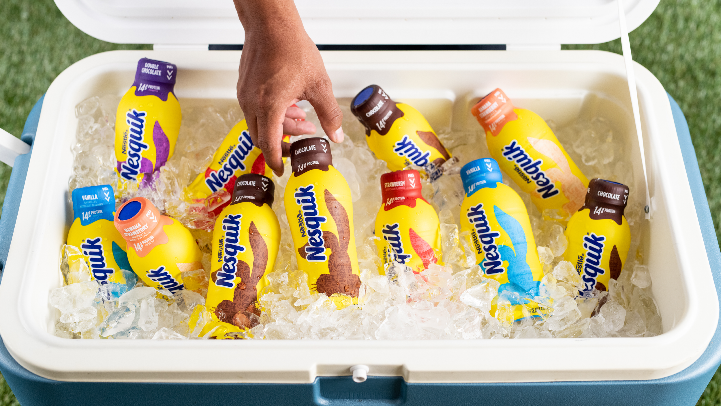
We designed the bottled beverage to speak to a young adult go-getter; and the beverage powder mix to introduce the playful Nesquik spirit to a younger generation while assuring parents that they are providing all the yummy, yet nutritious, goodness that their family enjoys. Our playfully designed product claims, drippy flavor bars, and a fully-rendered Quicky helped appeal to both kids and their parents.


Custom Font
The Quik Font Family is friendly and memorable. With its additional lighter weight, the two fonts are able to extend the charm of the logotype into a broader visual language.